Urban brand refresh
Founded in 2014, Urban’s an app for booking wellness treatments at home, across UK cities and Paris. By its seventh year, the business had grown substantially, but the brand hadn't kept up, with a fragmented look across app, web and ads. As then creative manager, I led the overhaul, massaging out the kinks to bring the same human touch therapists offered into the way the brand looked, felt and spoke.
-
Cultivated clarity and consensus among previously siloed teams
Used structured brand strategy methods to solve visual and tonal inconsistencies
Unified the brand around a tagline that spoke to what we did, but crucially the fair way we did it: bringing a human touch to city life.
-
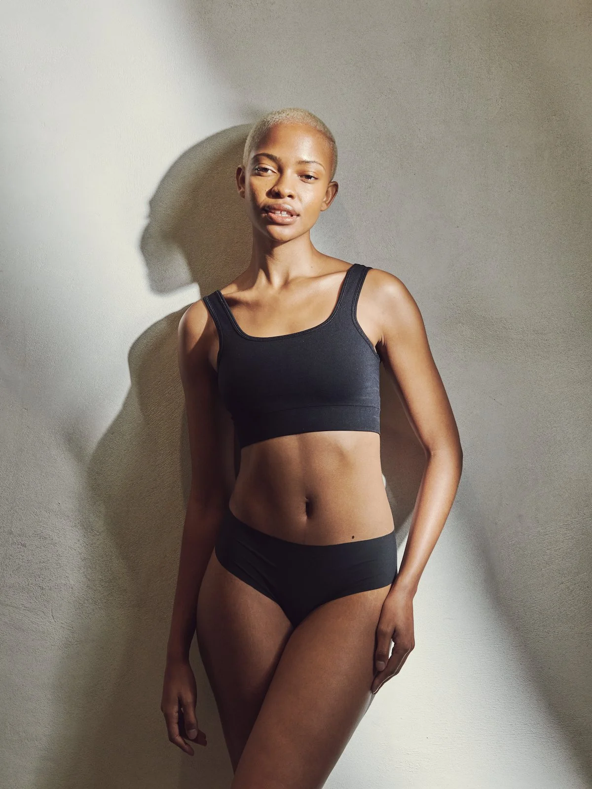
Sourced creative talent from the fashion world to bring editorial flair to the look and feel of the brand
Oversaw a full refresh of colours, fonts, tone of voice, video and image library
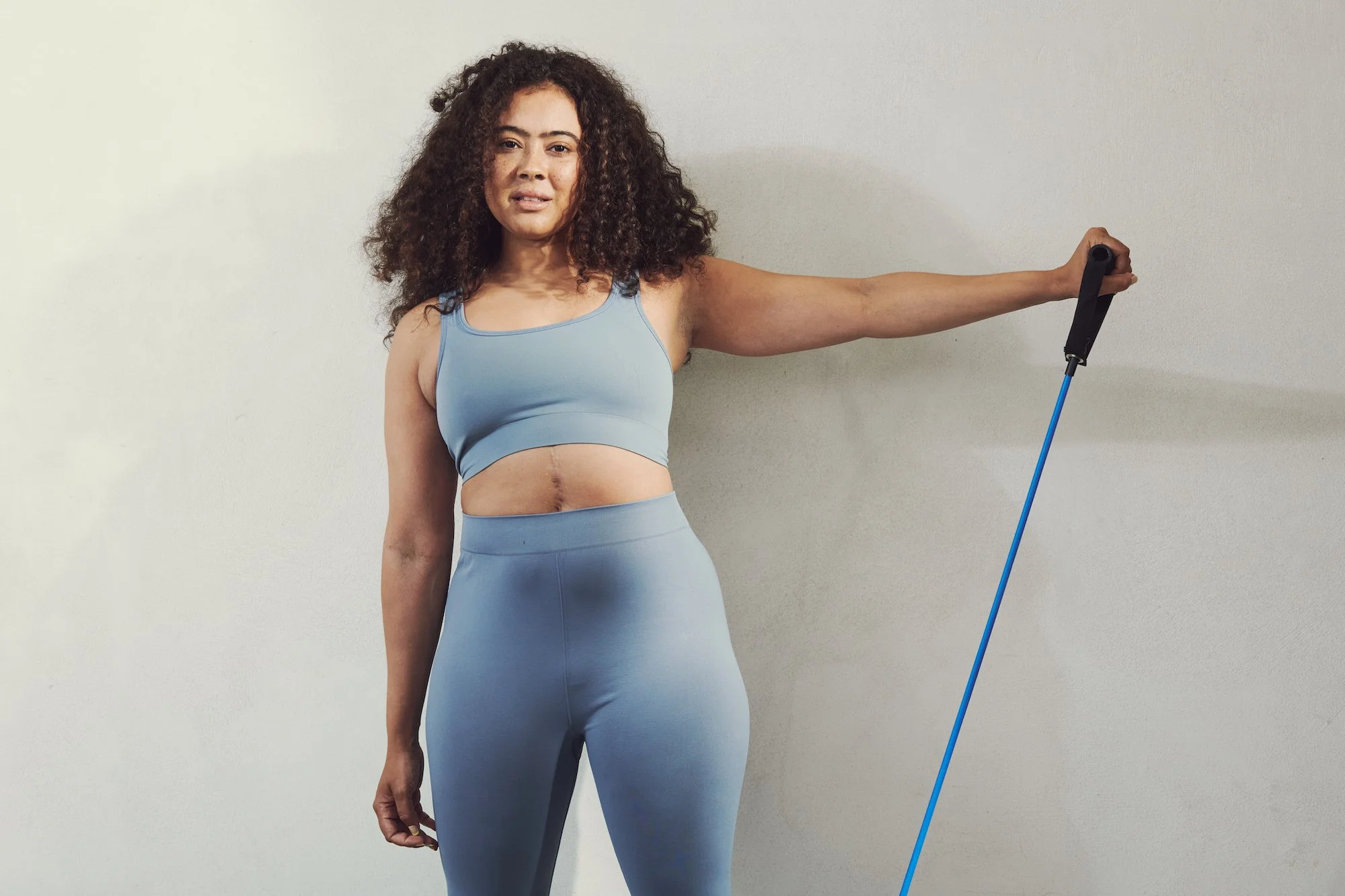
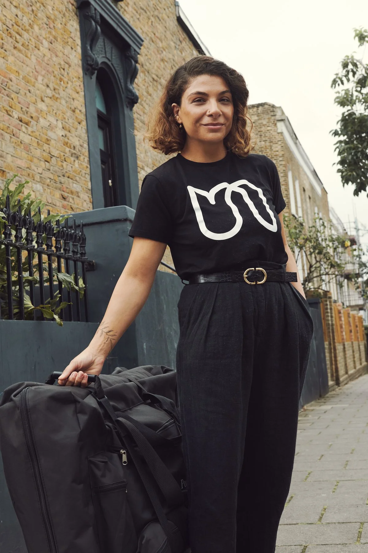
Produced large scale photo and video shoot, worked with inclusive model agency to ensure diverse representation
-
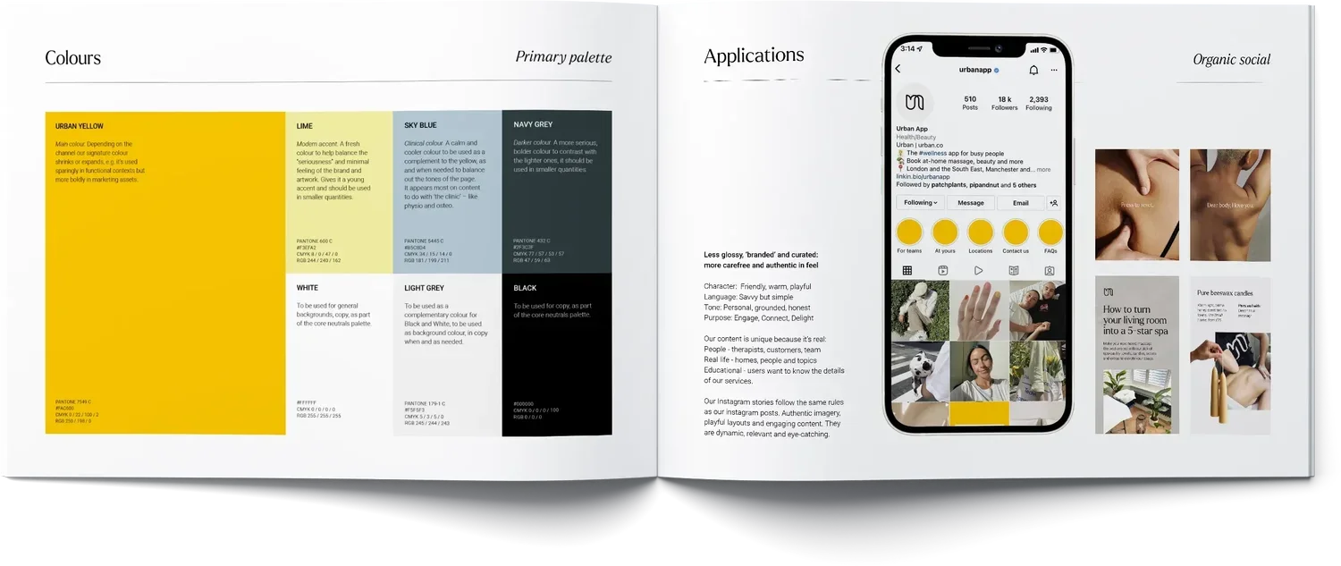
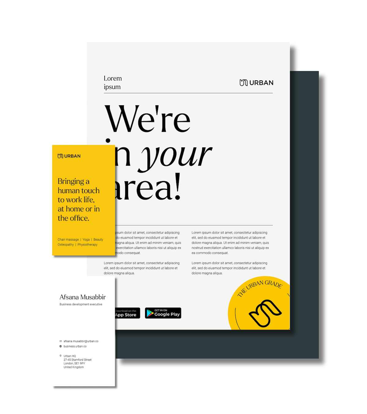
Refreshed colours, fonts, icons, tone of voice and style guide
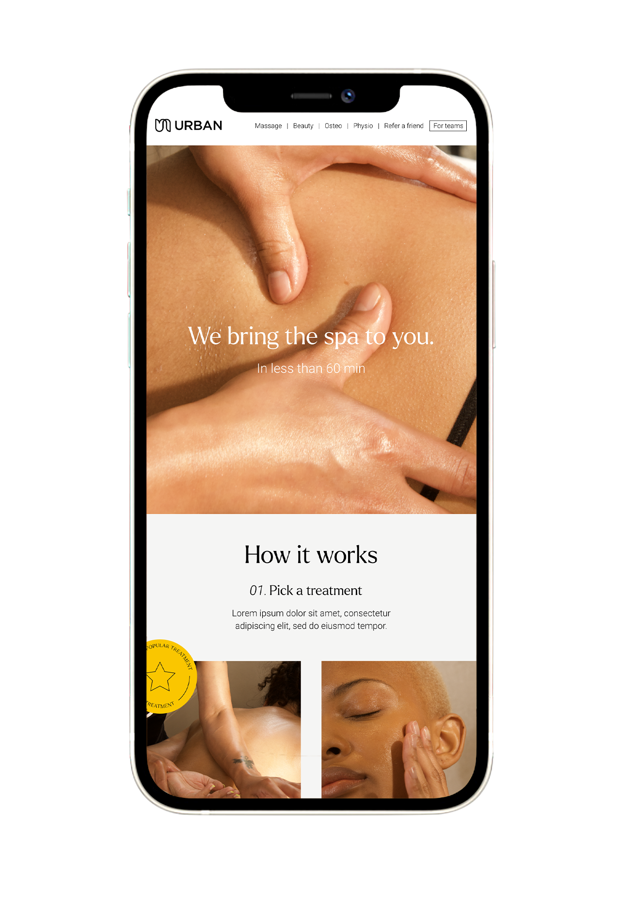
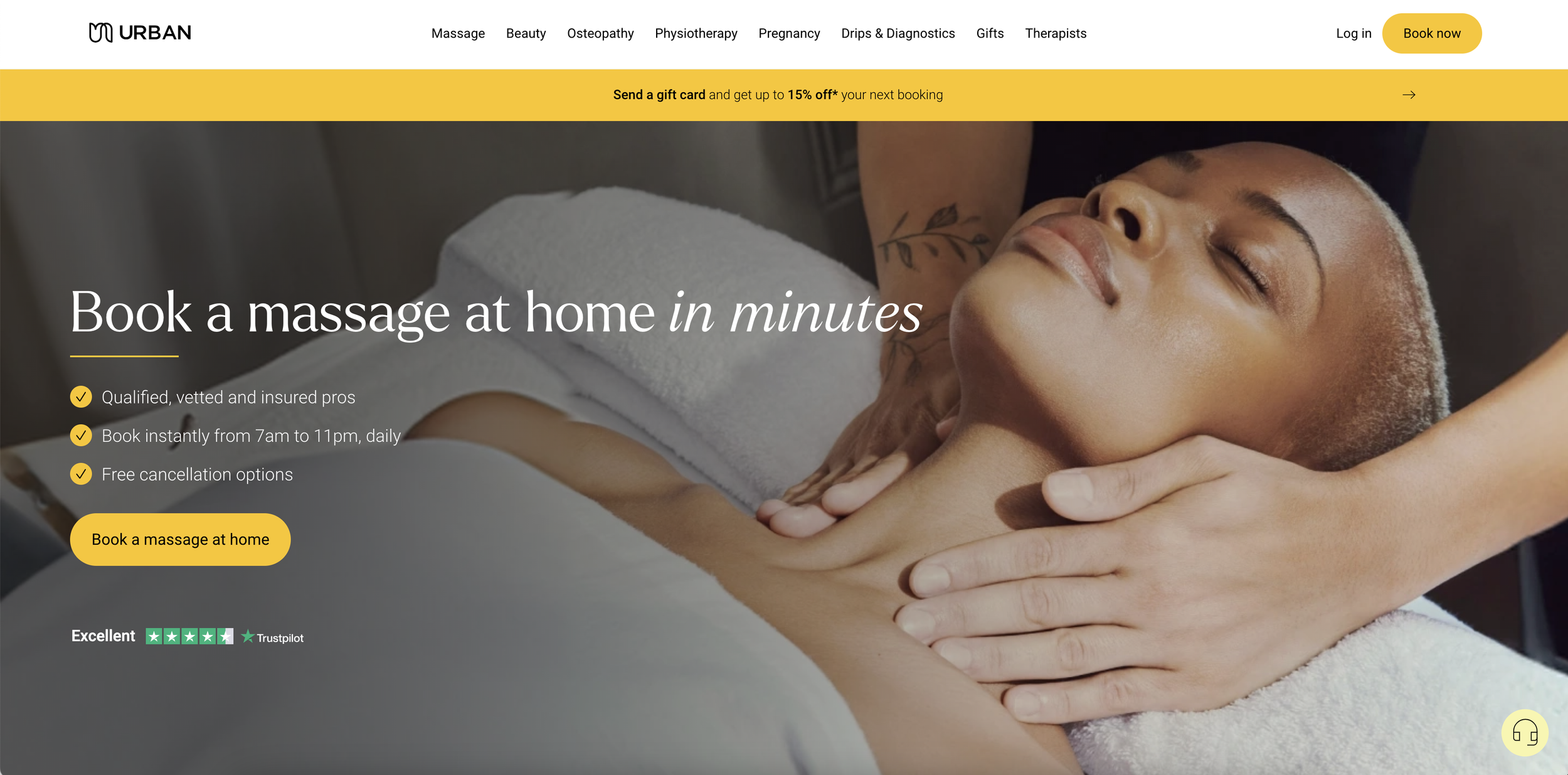
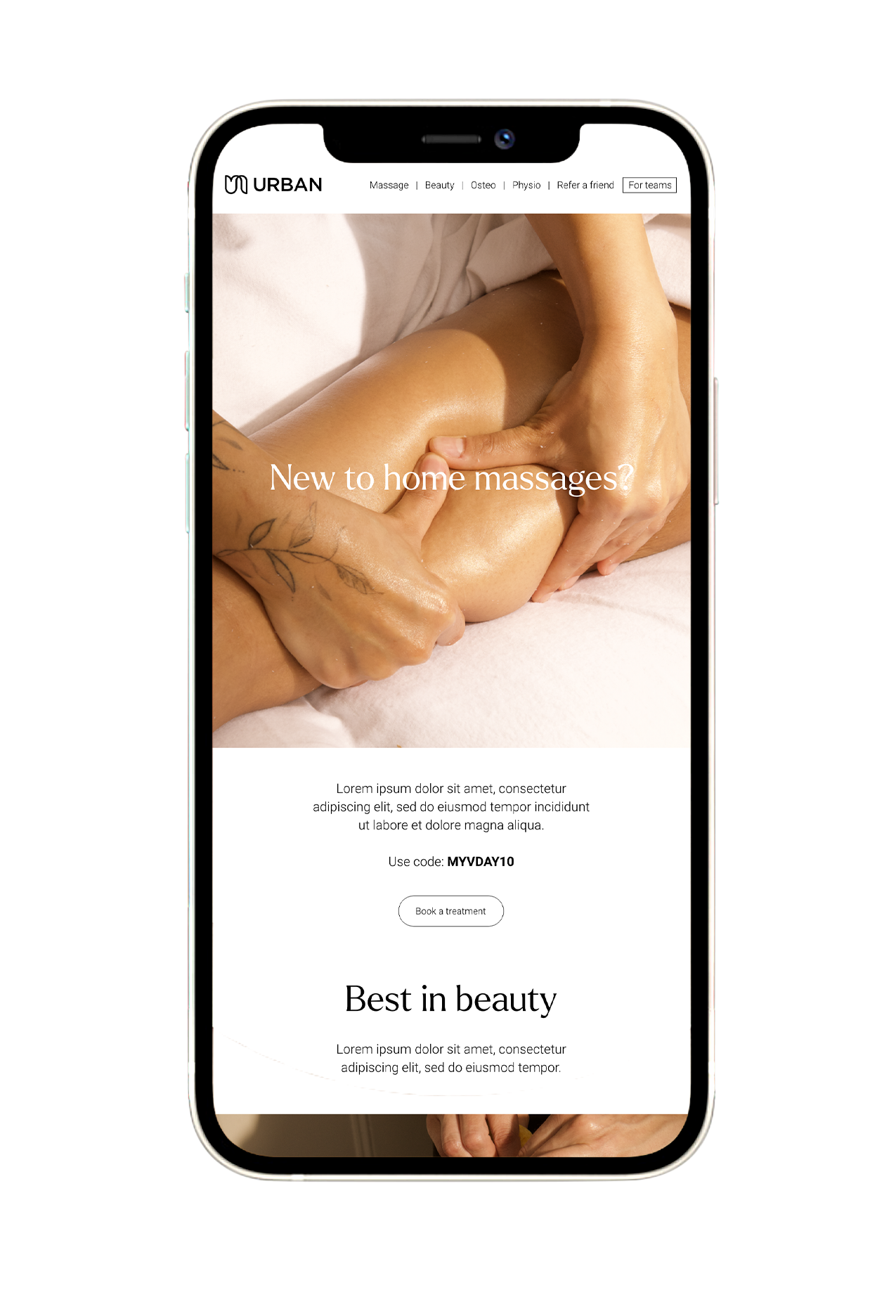
Rolled out across website, app, CRM, social, paid media and out of home
Fresh flyers, business cards, gift cards and merchandise
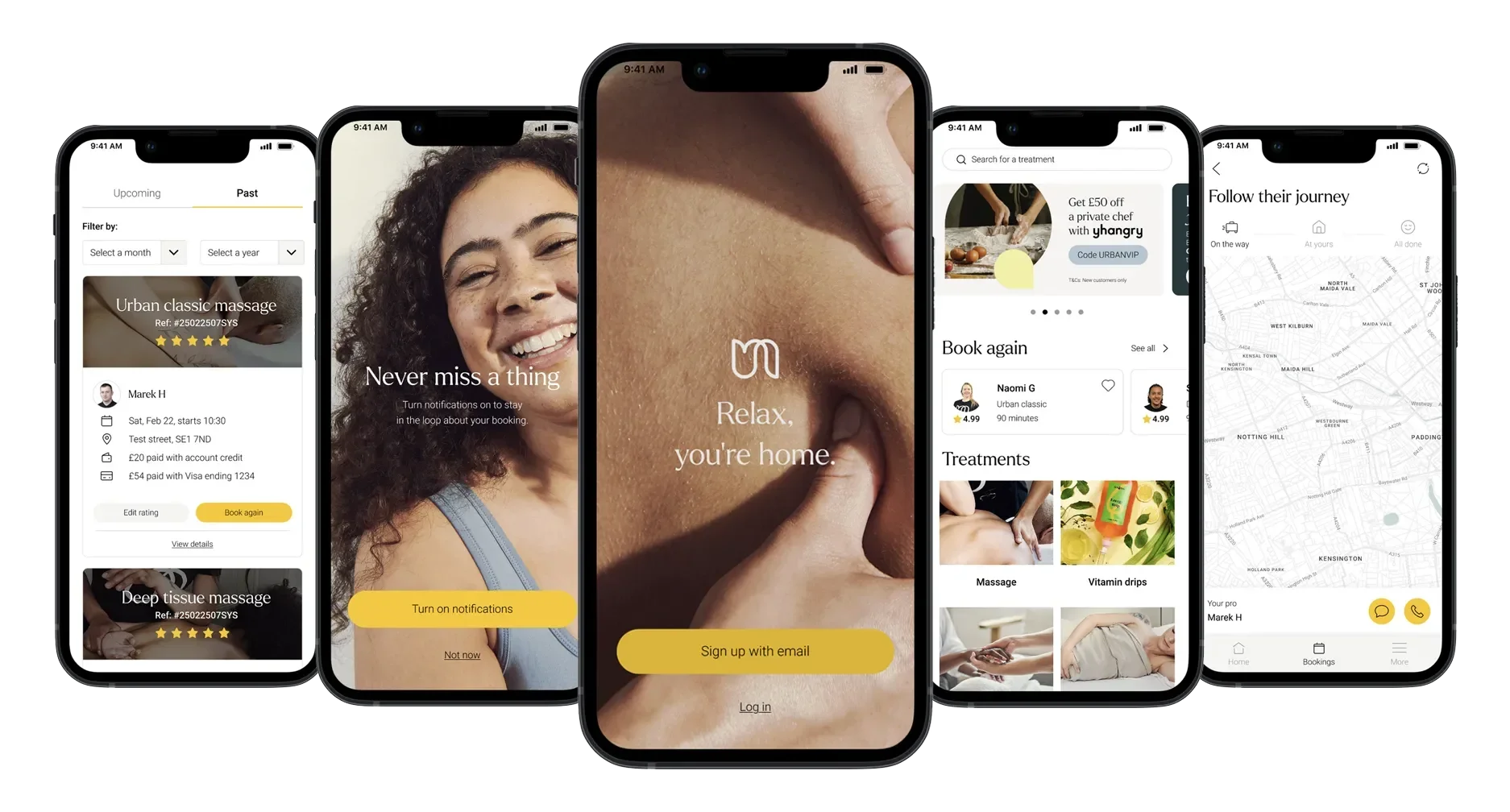
Achieved a long-delayed (and very manual!) app reskin which had previously been deprioritised
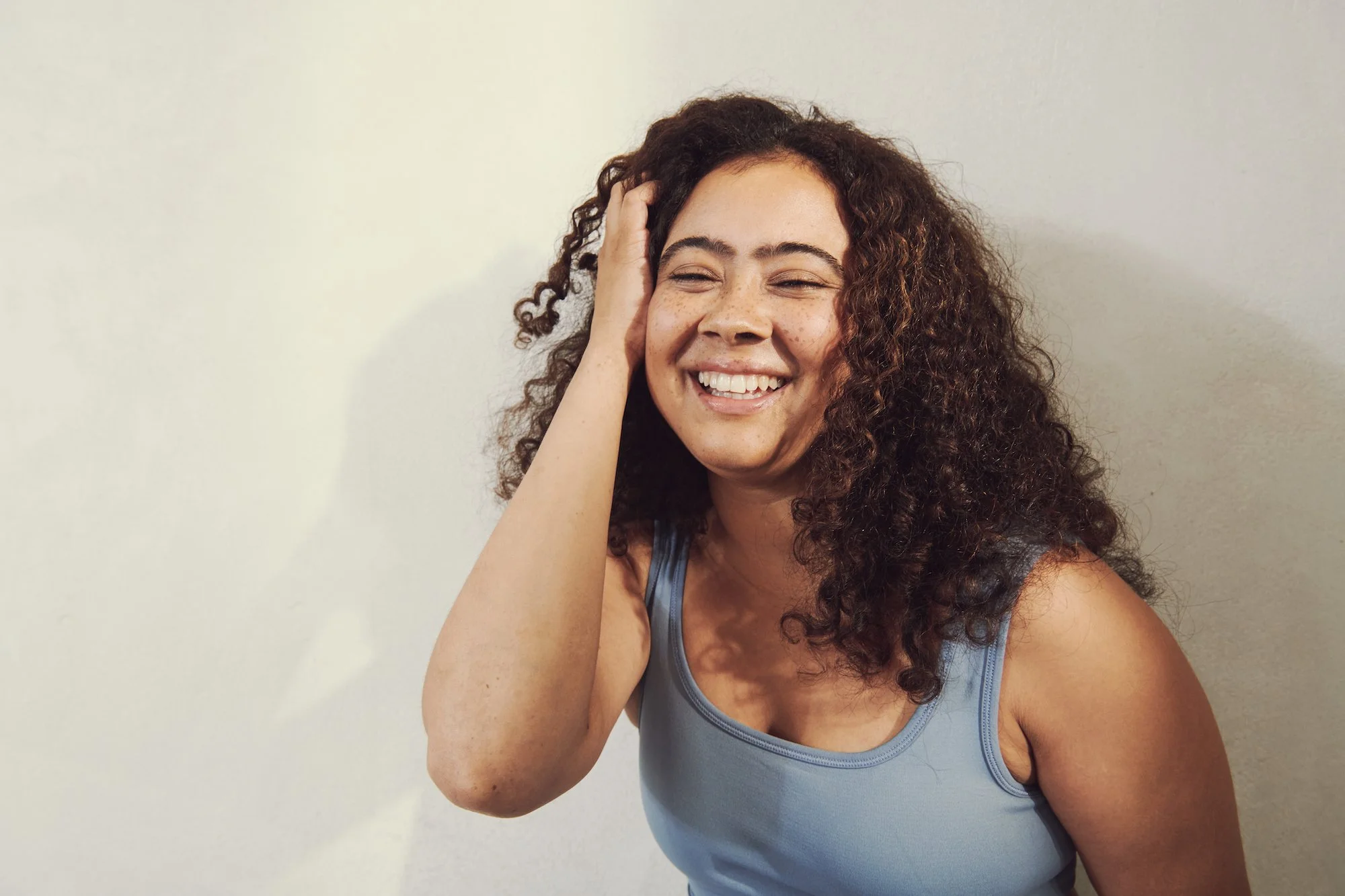
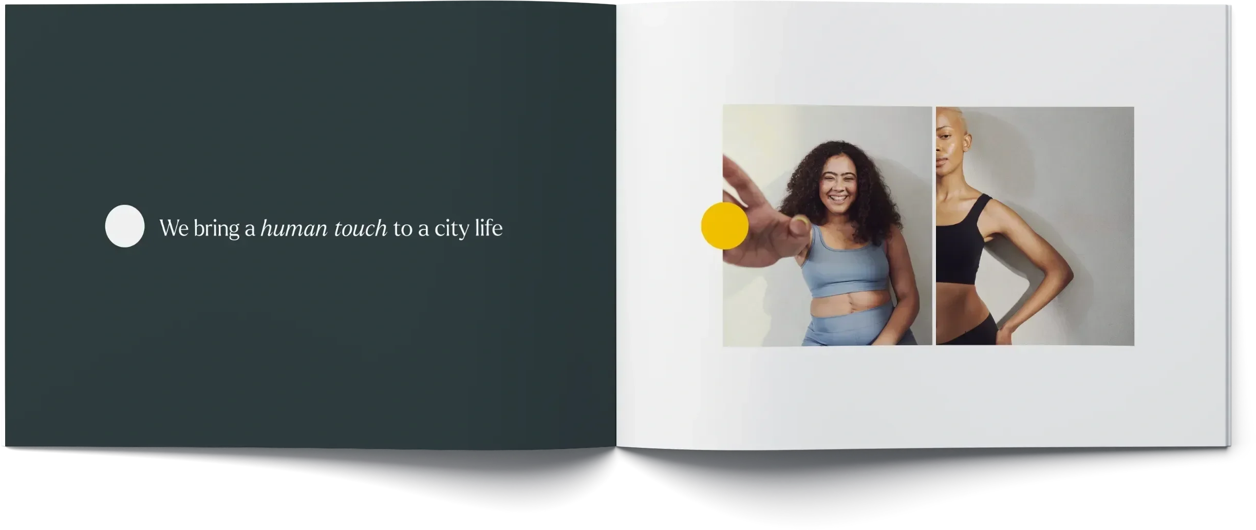
City life, with a human touch.
A strong brand needs clarity and consensus, and as the business grew, we were missing both. I worked to plant a flag on the hill – what we wanted the brand to be – that previously siloed teams could be united in marching towards.
We landed on a tagline (city life, with a human touch) that spoke to both the treatments we offered (home massage) and the fair way we did business, giving therapists 70%+ of the treatment fee.
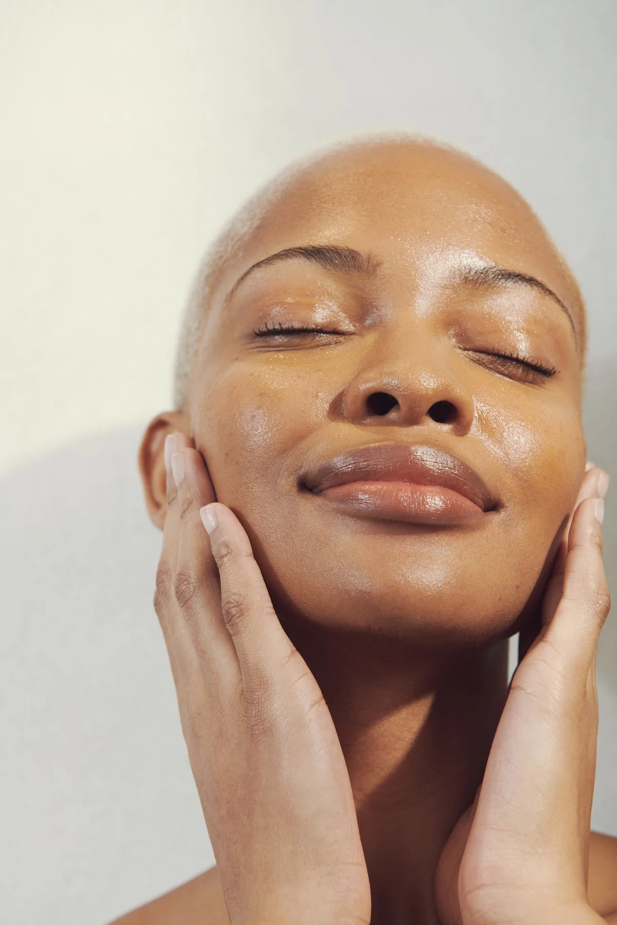

Choose any colour (as long as it’s yellow).
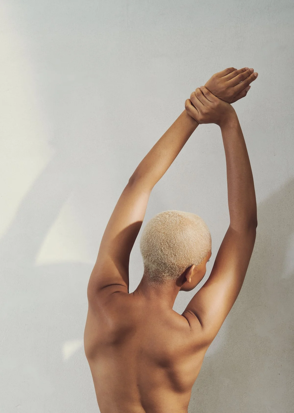
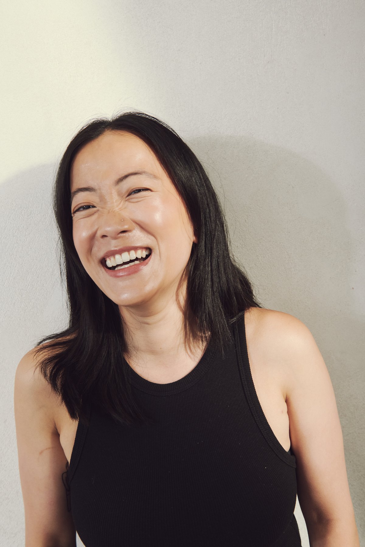
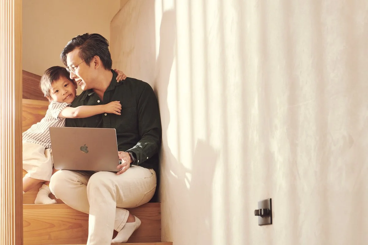
One thing was certain: we were known as the yellow massage app. The constraints of keeping such a bold colour alongside an equally harsh, concrete name (Urban), while still feeling soft, human and premium, was met by warming the tone of yellow we used and combining it with softer wellness-adjacent colours. For our signature image and video library, I brought on creatives from the fashion world - senior designer Teresa Belmar and photographer Joe Quigg - to bring out the sensorial nature of human touch.
Going beyond nice slides.
Product teams are rightfully protective of their time. I knew from the start of the refresh that convincing them of the value of prioritising an app reskin would be a challenge. I aligned stakeholders through one-to-ones, listening to their concerns and adapting the project to them. The app needed a component library building anyway, if not now, when? We agreed on six weeks to transform it screen by screen, alongside a website move onto Storyblok to empower the creative team to manage content ourselves. The result? A user journey that felt coherent from first click to post-booking, and a huge reduction in CPA as a result.
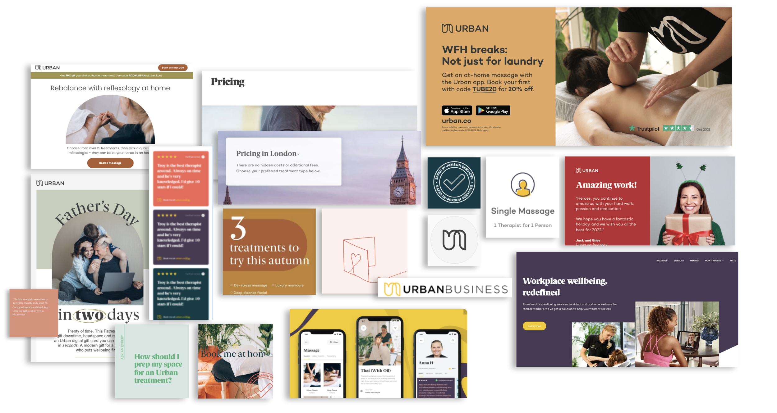
Before – inconsistency between touchpoints
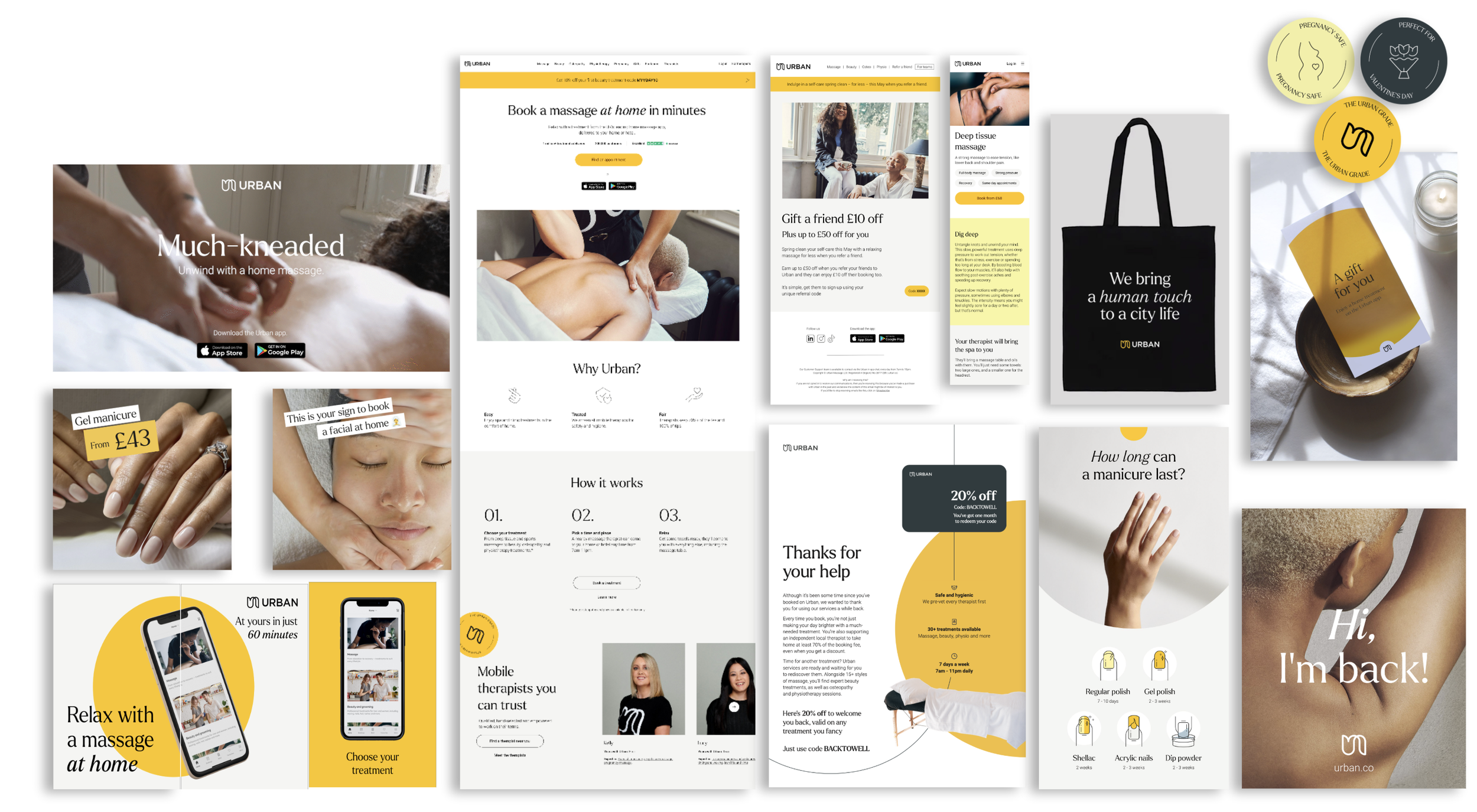
After – calm coherence
People-centred initiatives breathed life into the brand
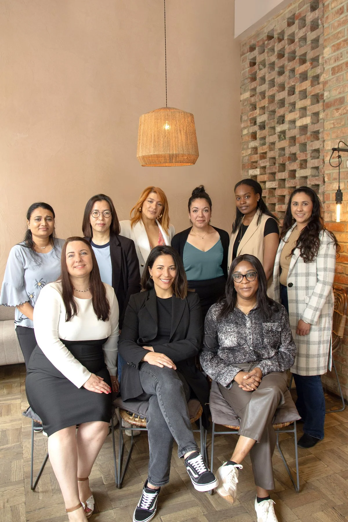
Hosting therapist community events gave therapists a welcome sense of connection in a profession that can feel solitary.

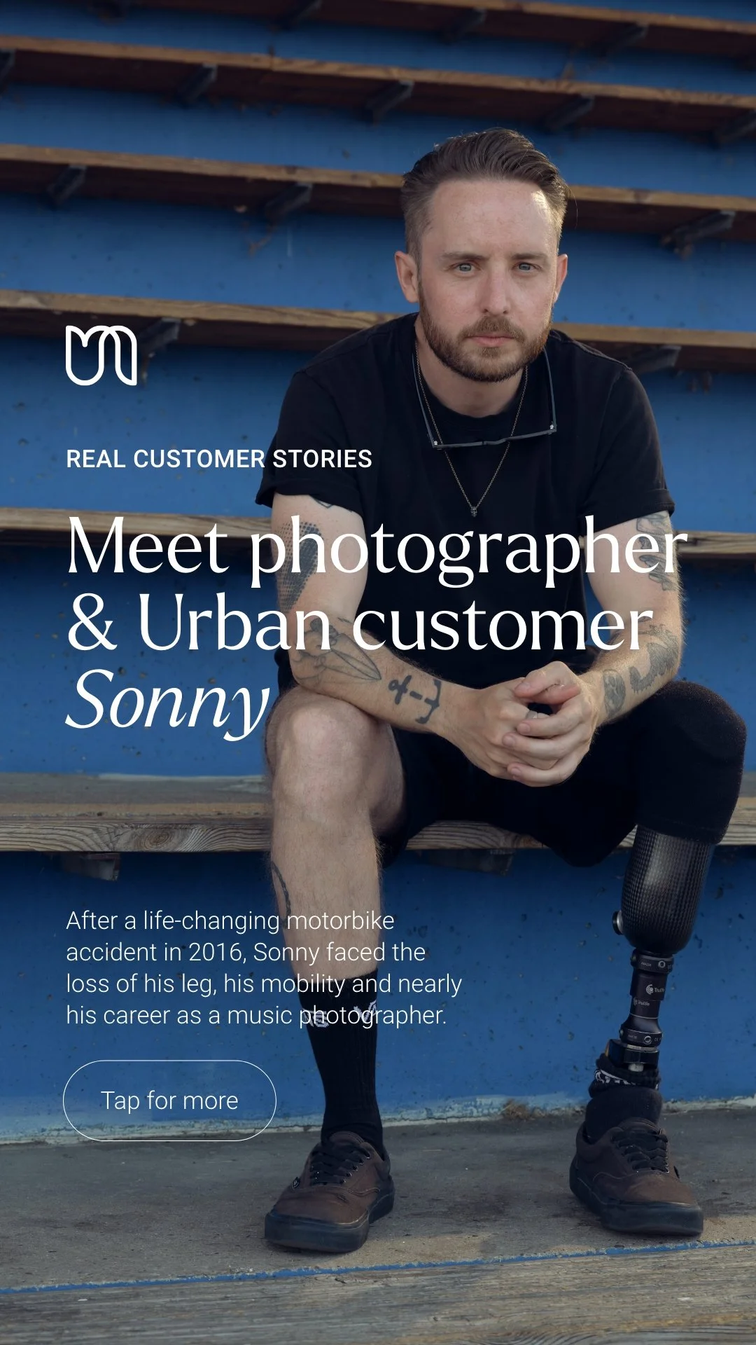
We empowered therapists to give out ‘golden tickets’ – treatment credit for clients they felt deserved it – in return for wholesome content.
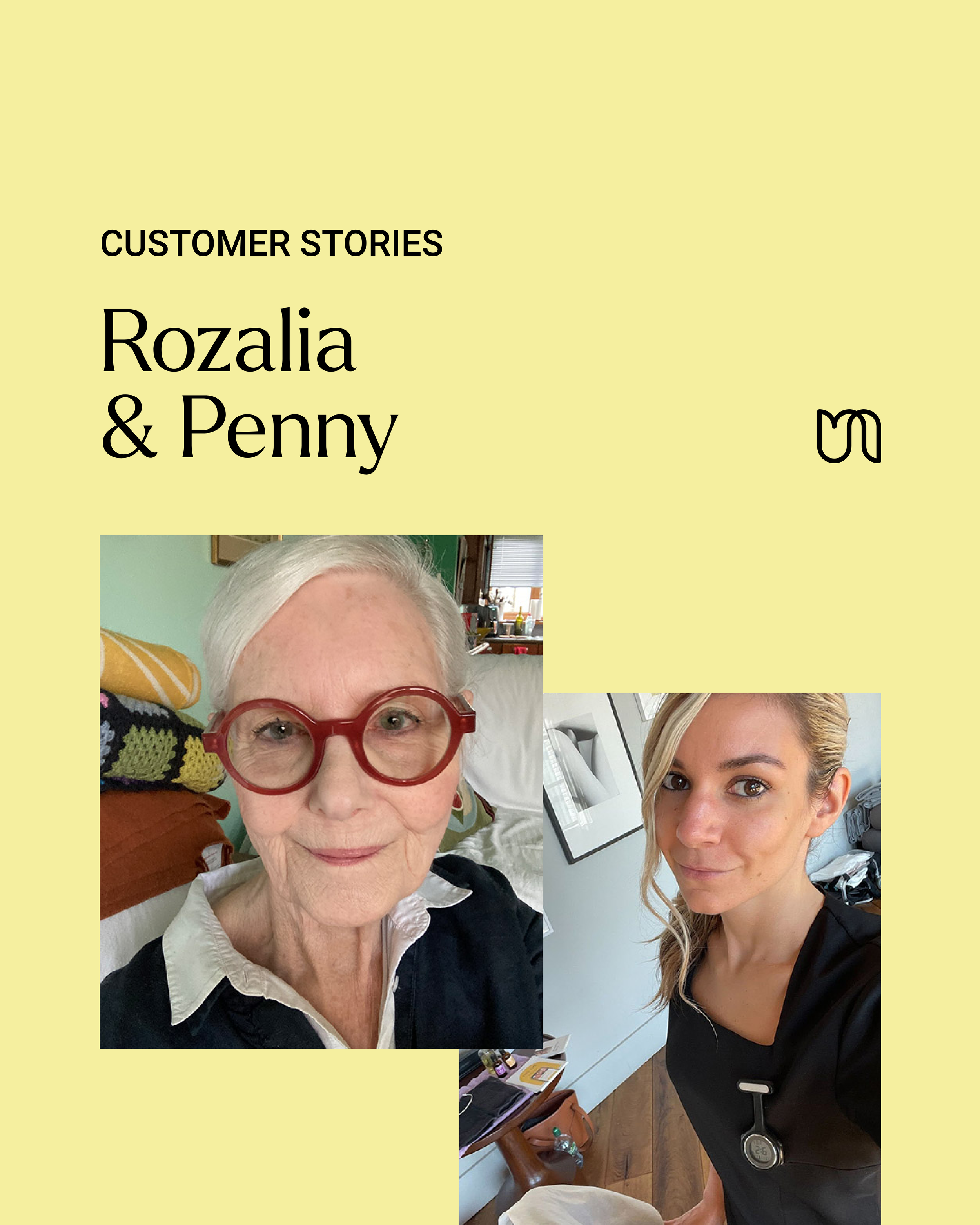
After a while, customers like Sonny started contacting us to share their stories – we’d achieved ambassadorship and felt honoured to platform inspiring tales.
Real customer began to feature in our ads, like this out of home campaign for our Edinburgh launch.
Conversion rates more than doubled.
After the refresh, top-of-funnel ad clicks increased by 42%, and the cost of getting them fell 47%. Further down the funnel, the same thing happened: clicks went up by 233%, and cost decreased 74%. Conversion efficiency more than doubled, validating the hidden damage a visually inconsistent brand was doing.

“Alice has exceptional creative judgement and strategic strength. From leading a website redesign to driving SEO strategy, she is comfortable diving into technical detail and collaborating closely with product and commercial teams to deliver high-quality results.
She brings real clarity to brand thinking, shaping direction that is both commercially grounded and deeply customer-focused. She consistently anchors conversations in brand values, ensuring strategy translates into meaningful, tangible outcomes.
She’s also an incredibly thoughtful and engaging person, and a highly valued team member who elevates both the work and those around her. I cannot recommend Alice highly enough.”
— Elsa Favario, Chief Commercial Officer, Urban
Photography by Joe Quigg, graphic design by Teresa Belmar, Jessie Cohen and Katie Scanlon.